aipen.ink › Blog › AI Handwriting Generator
AI Handwriting Generator: Authentic vs. Fake in Handwritten AI Notes
Finding an AI handwriting generator that transforms digital typing into beautiful physical writing is a real challenge. You want your essays and study guides to look organic and deeply human. Many platforms offer grand promises about making digital text handwritten, but all of them fail. Here are five simple evaluations that identify a truly advanced platform instantly.
Write a page free → 3 free pages. No card needed.
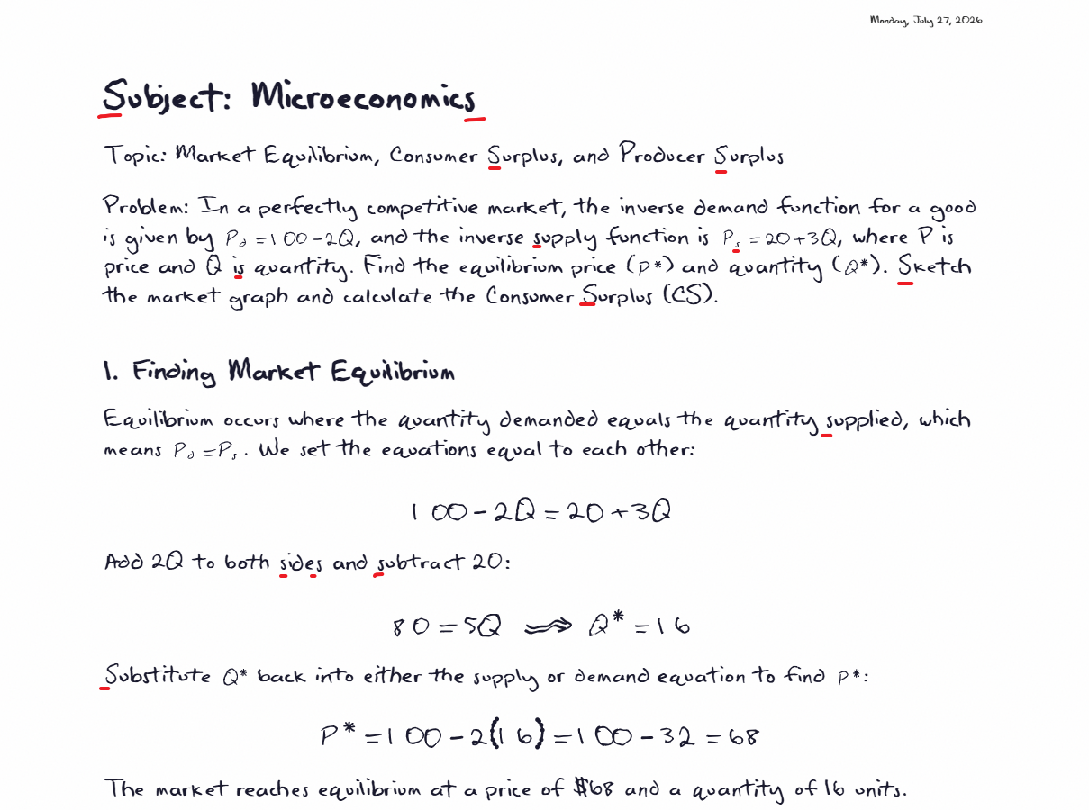
Check 1: The repetition evaluation
The rubber stamp effect
This is the fastest evaluation available. Type a word containing double letters, like bubble or assessment, and look closely at the result. A human hand acts like an artist holding a brush to give a naturally different curve every single time it moves.
If you notice two letters looking exactly identical, you are viewing a font. Human eyes detect these visual copies immediately, even when people cannot explain what feels wrong. A truly advanced platform draws every character from a large collection of natural variations, so every letter arrives with a unique visual identity. That continuous variation is the real magic of human authenticity.
Check 2: The advanced academic challenge
Protecting structural integrity
Scientific subjects need structure. Look at math, for example—almost all handwriting generators squash tall, stacked fractions and expansive calculus brackets into one unreadable horizontal line.
A premium platform understands structural academic rules. It builds tall fractions gracefully, places upper and lower calculus limits precisely where they belong, and expands brackets vertically to hold large matrices securely. If you plan to study from these documents, this feature is mandatory.
Check 3: The physical environment
Building the perfect canvas
Natural human writing lives on crisp graph paper or classic lined notebooks, written with a classic blue fountain pen or the formal black required for final exams.
A professional platform gives you total control over this canvas. You select the paper style (A4, A5, A3 landscape, etc.) and ink style.
Check 4: The final document quality
Scalable precision
Ask how the system delivers your final document. Many basic platforms hand you a simple picture file, which will blur and pixelate immediately when printed.
What you need is a premium scalable vector document. This format stays flawlessly crisp no matter how far you zoom in, and prints cleanly on any standard paper size at any scale. For university submissions, it is essential, not optional.
See it write a page in your own words.
Try it free →Check 5: Managing massive workloads
Seamless workflow integration
Moving large amounts of text should feel effortless. Basic programs force you to type every word manually into a tiny digital box, which feels like moving a mountain of dirt using only a small plastic spoon.
A professional workflow lets you paste entire textbook chapters instantly, attach full documents, and transfer complex paragraphs directly from intelligent chat assistants in seconds.
The five checks, side by side
| Check | Handwriting font | Real generator |
|---|---|---|
| Repeated letters differ | Never | Always |
| Stacked fractions and integrals | Flattened to one line | Proper layout |
| Paper, ink, and size choices | Rarely | Yes |
| Vector PDF export | Usually an image | Yes |
| Long documents and files | Small text box | Paste and attach |
Achieving flawless results
Aipen.ink is built on these principles from the ground up. Every character carries a unique organic shape naturally. The platform organizes complex structural mathematics flawlessly. You control the paper size, ink, texture, and more, and then download a crisp, scalable document ready for professional printing.
Integration with frontier AI models like Claude, Gemini, and ChatGPT means your mathematics is always correct. For more details on how Aipen.ink integrates AI models, check our blog: Hyper Realistic Handwritten Mathematical Notes and Equations: Generated By AI.
Frequently asked questions
What separates true platforms from basic fonts?
Basic fonts repeat identical shapes constantly. Advanced platforms ensure every single letter receives a unique natural variation, the way a human hand writes.
Will the system handle advanced science formatting?
Yes. The platform supports complex stacked fractions and properly aligned calculus brackets effortlessly, so notation-heavy subjects stay readable.
What specific file format should I demand?
Always demand a scalable vector document. It guarantees flawless printing on any standard paper size without blurry pixels.
Begin your testing process today
You can test all features for free at aipen.ink. Type a complex word, build a tall fraction, adjust your paper style, and download your crisp, scalable document. You receive three complimentary pages to experience true academic authenticity.
Try it for free →